Sinsay Redesign
A brief story about how I led changes in the user interface and managed their implementation in a way that was optimal in terms of design and integration into development.
The need for change
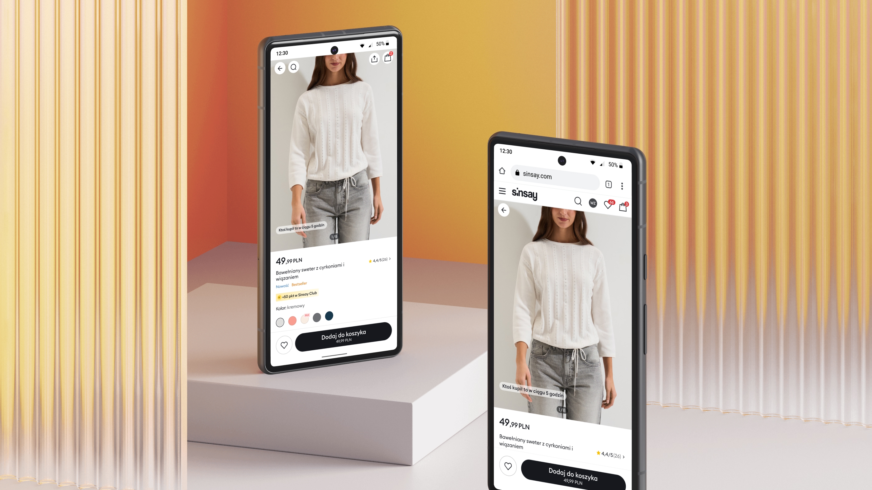
The redesign of Sinsay was not driven by aesthetics alone. It was a response to a growing mismatch between the brand’s ambitions, the scale of the product ecosystem, and the visual language that supported it.
At the business level, a new vision for brand development required a UI that could evolve quickly and remain consistent across markets. At the product level, the mobile application and the online store had begun to drift apart stylistically, despite serving the same users and brand promise. At the system level, the existing UI foundations made it increasingly difficult to introduce new directions without accumulating inconsistencies.
The key drivers behind the redesign were:
- A new top-level vision for brand development that required a scalable and future-proof UI.
- The need to restore stylistic consistency between the mobile application and the e-commerce website.
- The lack of a neutral, flexible UX/UI environment capable of absorbing global and local changes without friction.
The goal of the redesign was therefore not only to refresh the interface, but to create a visual and structural foundation that would support long-term product growth.
The architect's perspective
As the UI architect, I initiated a new visual identity for Sinsay, starting with a proof-of-concept that I discussed and refined with both the design team and stakeholders. This PoC wasn’t just a draft, it defined key principles that would guide all future design decisions across platforms.
From there, I coordinated the visual transformation, mapping the design phase so that parts of the work could be handed to production teams efficiently. By doing so, I ensured that the initial scope was clear, scalable, and aligned with development, setting a solid foundation for long-term consistency.
Design management & execution
Leading the design management, I oversaw the transformation of Sinsay’s UI from initial PoC to full implementation. I mapped out the design phase to ensure parts of the work could be efficiently handed to production teams, while maintaining a clear scope for development.
By coordinating designers and developers closely, I established a shared understanding of priorities, accelerated decision-making, and reduced unnecessary iterations. This approach ensured that design changes were applied consistently across components, forming a solid foundation for both the mobile app and web platform.
First draft
I started by taking a bird’s-eye view of the entire application, mapping out a new overall vision for the UI. Alongside the long-term roadmap, I explored alternative visual directions to ensure we had options and could make informed decisions.
We refined the concepts and eliminated dead-ends before the wider design team got involved. This approach sped up decision-making, allowed designers to work efficiently, and set a solid foundation for the subsequent stages of the redesign.
Lean on the foundation
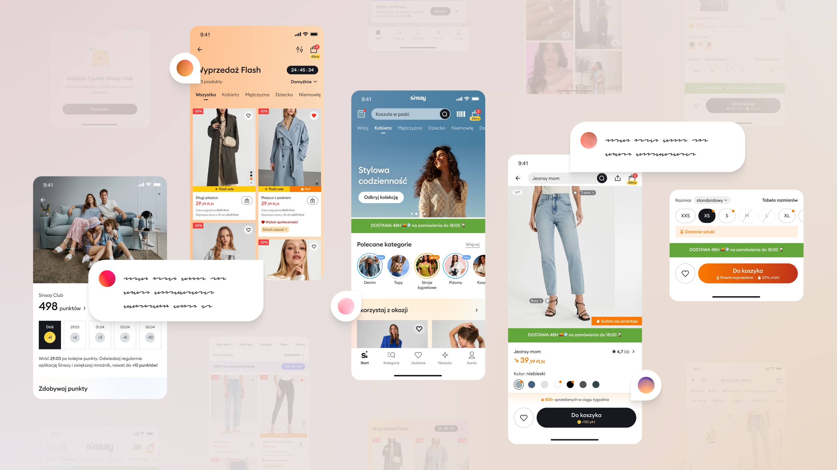
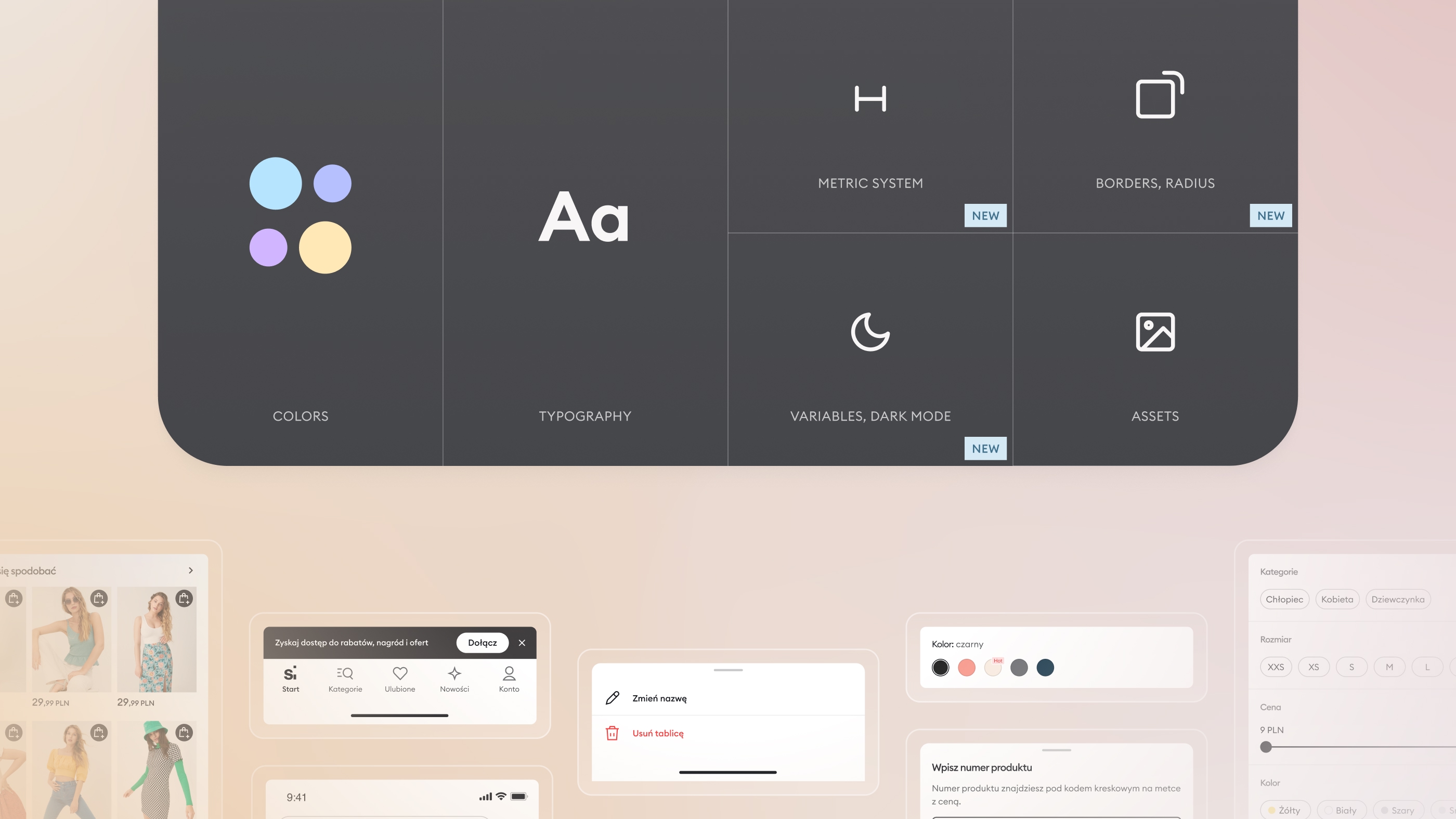
In close collaboration with the UI team, I led a thorough reconstruction of the existing design libraries. We updated the foundation files, including colors and shades, new tokens, typography, metric system, iconography, and illustrations..
These updates were then systematically mapped onto components, allowing many changes to propagate automatically and consistently.
By continuously referring to the previously developed PoC and testing components in real views, the team fully understood the purpose and impact of each change.
Dual-track execution
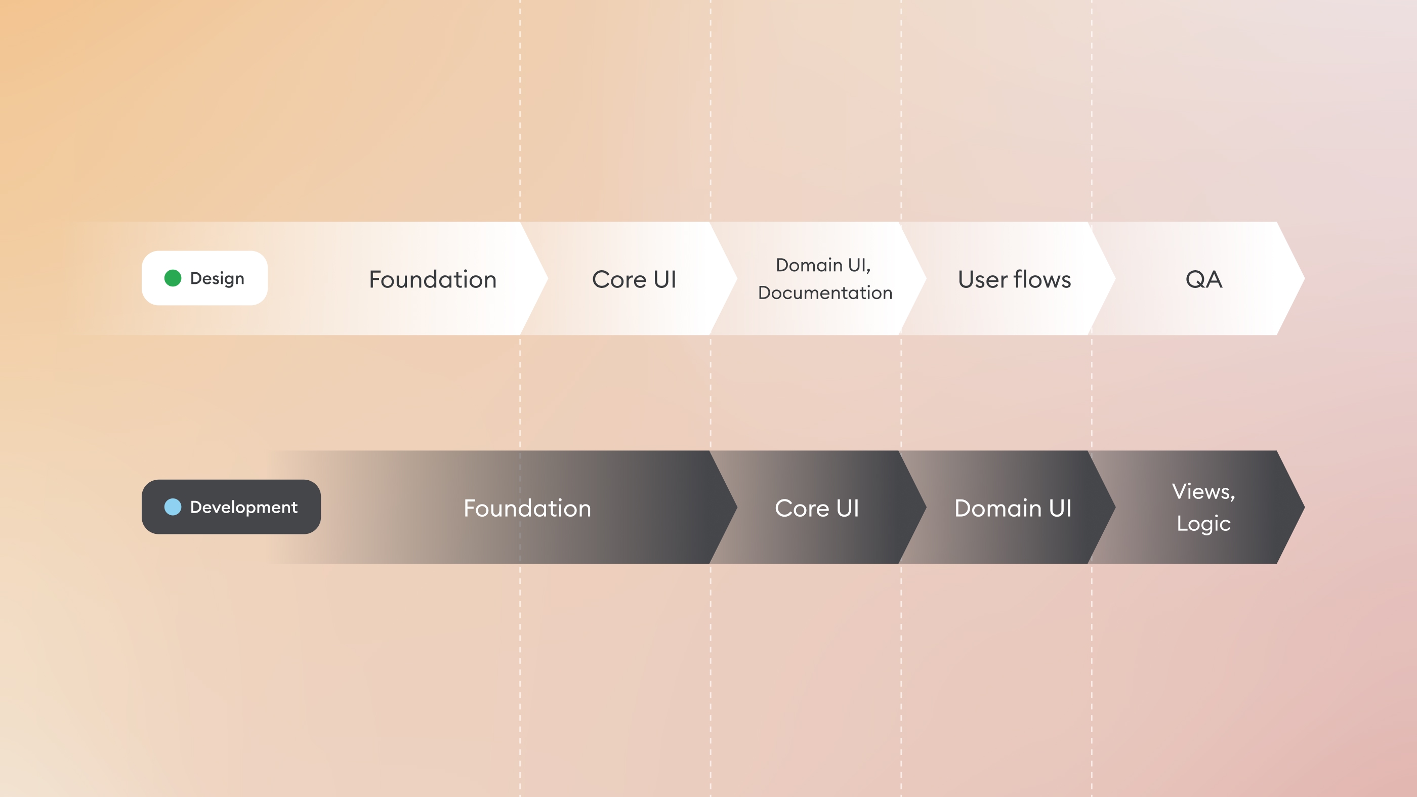
Once the key scope of work was defined, we began creating views across different areas, while simultaneously enabling the development team to start implementation.
Together with Android and iOS architects, we evaluated existing solutions, estimated timelines, and confirmed the actual development scope. This allowed us to create tasks and kick off development on a solid foundation.
Meanwhile, the remaining design work was distributed among the team. We identified critical views and flows, and determined where components or documentation required further refinement.
By leveraging the reconstructed foundations and referencing the PoC, we ensured that both design and development tracks progressed in parallel, maintaining alignment and minimizing friction..
Attention to detail
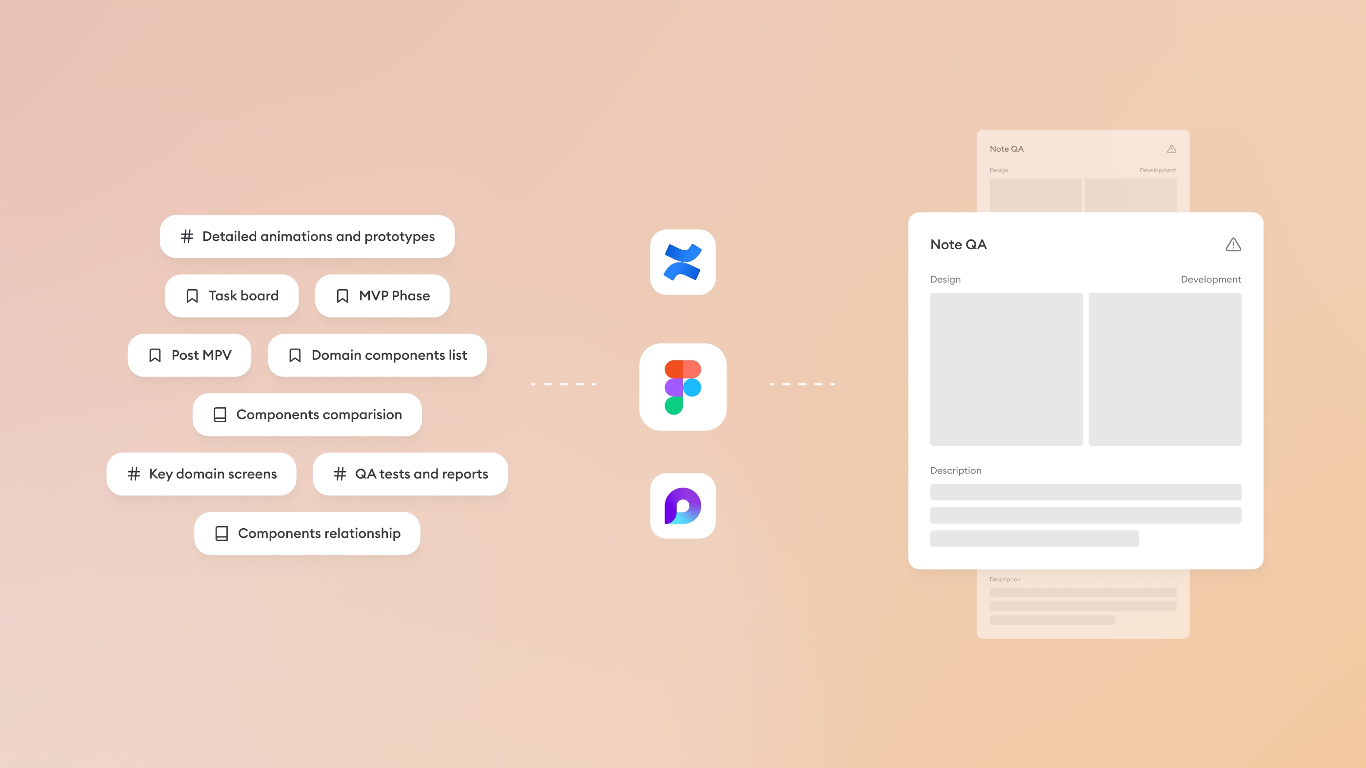
Beyond the design work itself, the project relied heavily on detailed documentation in Figma and Confluence/Loop. This shared knowledge base continuously supported production teams and dozens of contributors, reducing repetitive explanations and easing the workload on designers.
At the final stage, I recommended and oversaw and help itself acceptance tests to assess the overall impact of changes, identify inconsistencies, and prioritize necessary adjustments. The reports were reviewed with product owners, developers, and both area and regression testers.
The comprehensive testing process, with our involvement from start to finish, strengthened the organisation’s confidence in the redesign while solidifying our position as the team driving the UI transformation.
Multi-platform alignment
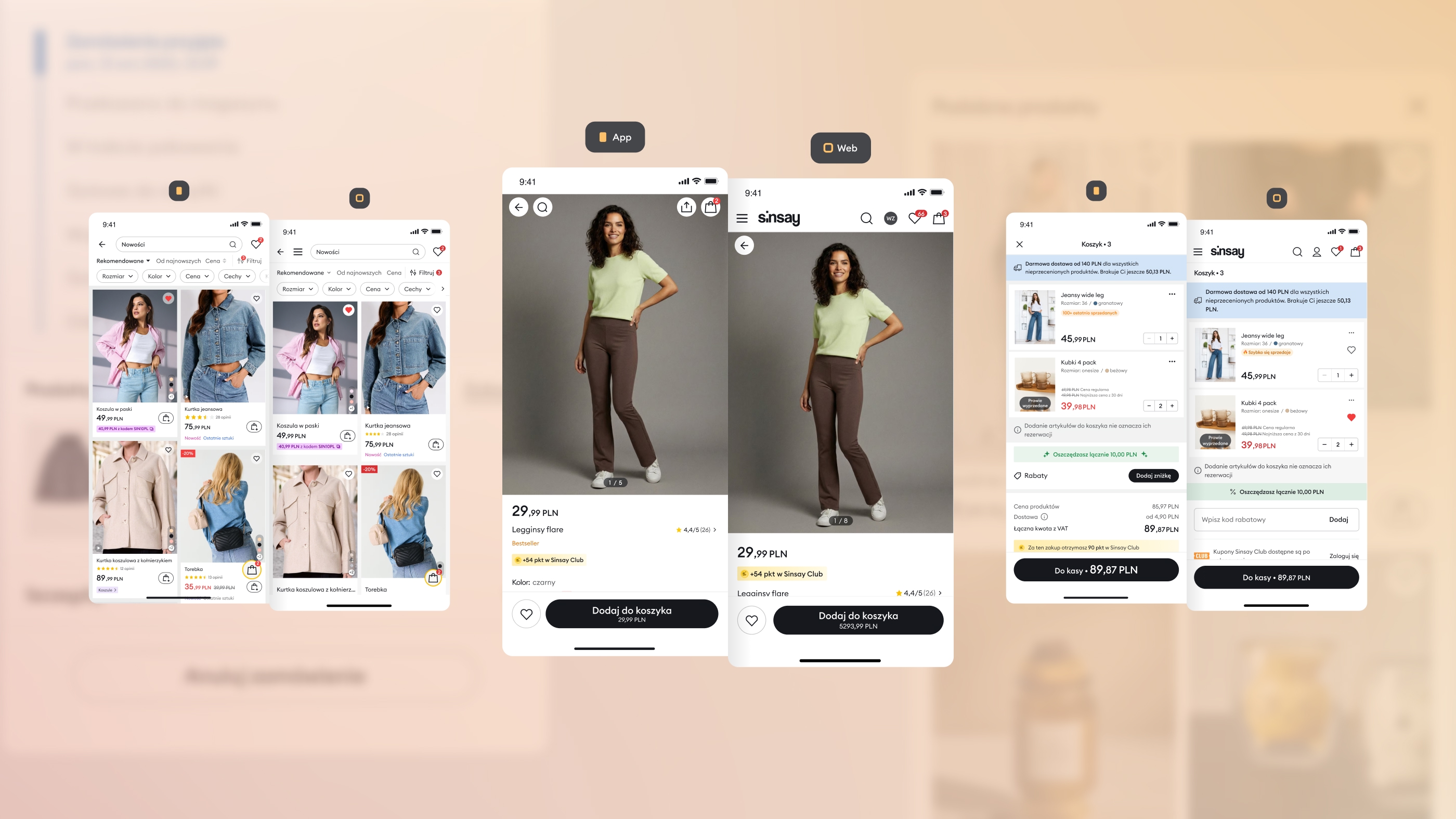
One of the biggest challenges for me was the fact that the initiatives to redesign the mobile application and website were carried out as formally separate projects. Despite different technologies and schedules, my priority was to maintain a single, common identity for the Sinsay brand.
I managed to maintain a twin decision-making and design process and organise cooperation between designers and manufacturing teams in a similar way.
Conclusion
Acting as an arbitrator and UI architect allowed me to connect strategic intent with day-to-day execution. The redesign was not only a visual refresh, but a shift in how design and development collaborated at scale.
By grounding decisions in a shared PoC, rebuilding the foundations of the design system, and aligning design work with development timelines, we created a shared working ecosystem in which UI changes could be introduced with clarity and confidence.
Although the app and web redesigns were executed as separate, long-term initiatives, the shared foundations and decision framework allowed both tracks to remain visually and structurally aligned over time.
Since the redesign was implemented, the Sinsay app has undergone numerous real-world tests through ongoing development and iteration. These consistently validated the robustness of the new foundations and confirmed that the redesign successfully met both business and product needs.
This project strengthened my approach to leading large-scale UI transformations: focusing less on isolated screens, and more on systems, alignment, and long-term sustainability.
If you want to learn more about this project, catch me on LinkedIn.