Redesign Reserved
Co-creator and coordinator across design, development communication, testing, and cross-functional teams.
Context & Challenge
Reserved, alongside Sinsay, stands as a flagship brand within the LPP portfolio. As a well-established player in the European market, it competes directly with global fashion giants present in the world’s most prestigious shopping malls. As the brand’s identity and ambitions evolved, a critical need emerged to align the mobile application with its current high-end image.
The decision to lead the redesign through the mobile app was strategic—mobile is currently the primary touchpoint between Reserved and its customers. The challenge was not to build something from scratch, but to execute a sophisticated evolution of a mature product while maintaining stability and performance for millions of users. The project kicked off with a preliminary Proof of Concept that defined the new aesthetic direction, approved by Reserved’s Art Directors. My task was to take these artistic decisions and translate them into a scalable, production-ready interface.
My role
I joined the project following the PoC phase, taking full responsibility for its further development and large-scale implementation. My primary objective was to extract the essence of the proposed style and transform it into consistent UI foundations for both existing and upcoming features.
Beyond design execution, I led the UI Design team, coordinated efforts between various project squads, and worked in close alignment with iOS and Android development teams. A pivotal part of my role was integrating design deeper into the product development lifecycle, extending our influence all the way to the Quality Assurance stage.
New UI Foundations
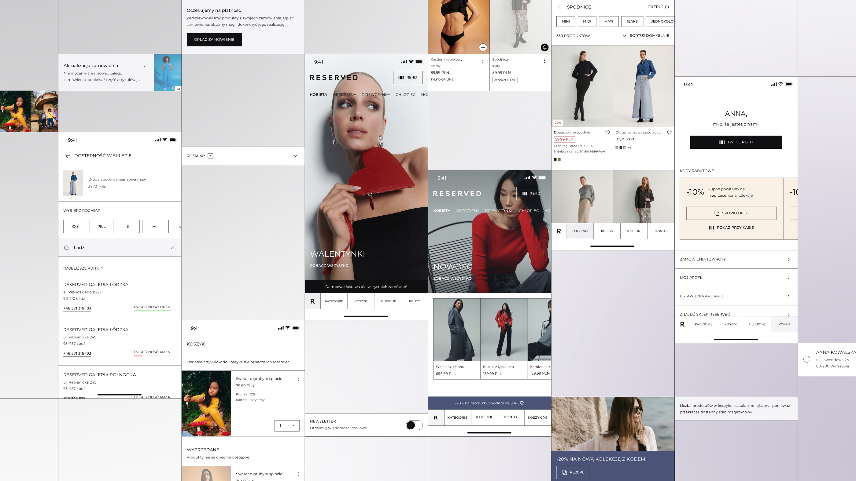
The new interface was built on a modular philosophy rooted in a consistent grid. We introduced thin, high-contrast lines intersecting at right angles as a core visual element. This created a rhythmic layout that provides the interface with much-needed "visual breath".
To complete the transformation, we simplified the typography—placing a stronger emphasis on uppercase styling—completely redesigned the iconography, and prioritized bold, high-impact product photography. These elements combined to form a cohesive new UI identity for the Reserved app.
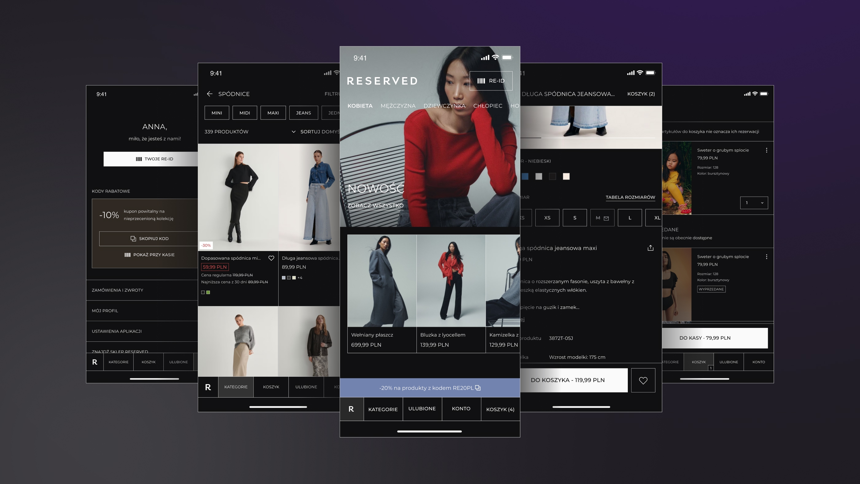
Dark mode as a first-class citizen
In this redesign, dark mode was never an afterthought. It was treated as a primary context of use. This decision was purely data-driven: nearly 60% of our users on both iOS and Android use dark mode as their default system setting. By focusing on a modular structure, conscious contrast, and consistent use of color and type, we ensured the app maintains its premium aesthetics and readability across both themes without any quality compromises.
Scaling the design
One of the most significant challenges was managing the sheer scale and sequence of changes. We approached this in phases:
- Foundations first: We began by updating core UI elements: colors, typography, icons, empty state illustrations, and Lottie animations.
- Component mapping: We audited component coverage across all app areas to prioritize their updates effectively.
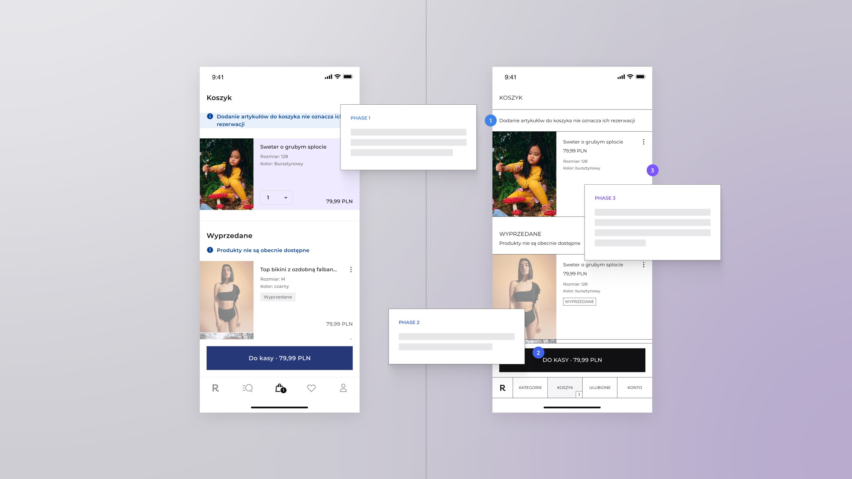
- View-by-View implementation: We developed dedicated "side-by-side" documentation comparing the old UI with the new. This allowed developers to focus on layout, spacing, and hierarchy changes without missing critical details.
- Functional evolution: Major changes affecting app functionality were scheduled for the final stage, backed by qualitative user research to mitigate product risk.
Design & development collaboration
Continuous collaboration between designers and developers was the cornerstone of this project's success. We established regular syncs and clearly defined scopes for each sprint. This allowed us to co-create documentation and adapt to technical implementation realities in real-time. Managing two different tech stacks (iOS and Android) with varying architectural levels was a challenge, but we successfully unified them into one cohesive process.
Our design responsibility didn't end at the "handoff." We actively participated in QA and UAT (User Acceptance Testing) to own the quality of the final interface. I designed a specific process for reporting visual and behavioral bugs, ensuring clear communication between designers, QAs, and developers. Working closely with regression testers was a particularly valuable experience that significantly raised the final product's polish.
Learnings & impact
The Reserved redesign was a milestone project for me, marking the first time I led an entire UI Design team and directly shaped the design-development process. Beyond successfully scaling a unique visual style across a complex app, I learned how to guide a team through a non-standard, system-driven workflow.
The project reinforced my belief that the greatest value of a UI Architect or Lead Designer isn't just "designing screens"—it is the ability to scale a vision, bring order to complex processes, and safeguard quality where design, technology, and business meet.
If you'd like to discuss this project, systemic UI design, or leading design processes in large-scale organizations—feel free to reach out to me on LinkedIn.