Multibrand Design System
A clever and more flexible approach to design.
Goal
Opportunities to develop products managed under a single “wallet” are rare. Even rarer—when they are brands or sub-products that complement one another.
I was given the chance to rethink our design approach and shape everything that comes out of the design department.
How did we reduce the number of files from 30 to 10? How do variables and multi-layered structures improve decision-making in design? How does live sync instantly reflect those decisions in code? Grab a coffee and enjoy the ride.
About the product
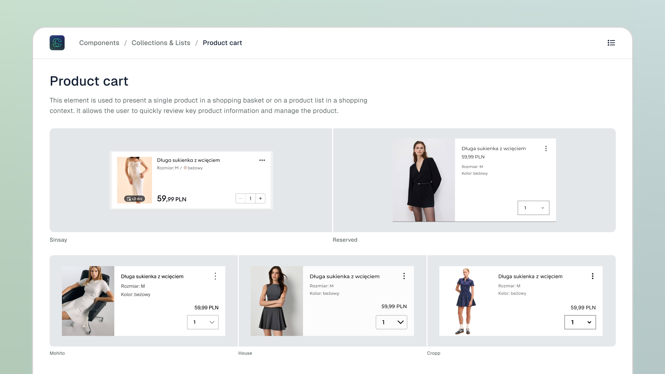
LPP owns five fashion brands: Sinsay, Reserved, Mohito, House, and Cropp. Each has its unique character and audience. They evolve at different speeds, and their business and user needs vary significantly.
The fastest-growing brand is Sinsay, with a broad product range and an extensive loyalty program.
When teams are building, developing, and delivering new features, timing and dynamics are key.
Solution
To match the speed of growth and the diversity of brands and products, we had to rethink how we create—from design to code.
With the new setup, we developed processes that simplify many design decisions. We significantly reduced the time spent on repetitive, tedious tasks.
As a result, we gained time for ideation, creative exploration, and validation.
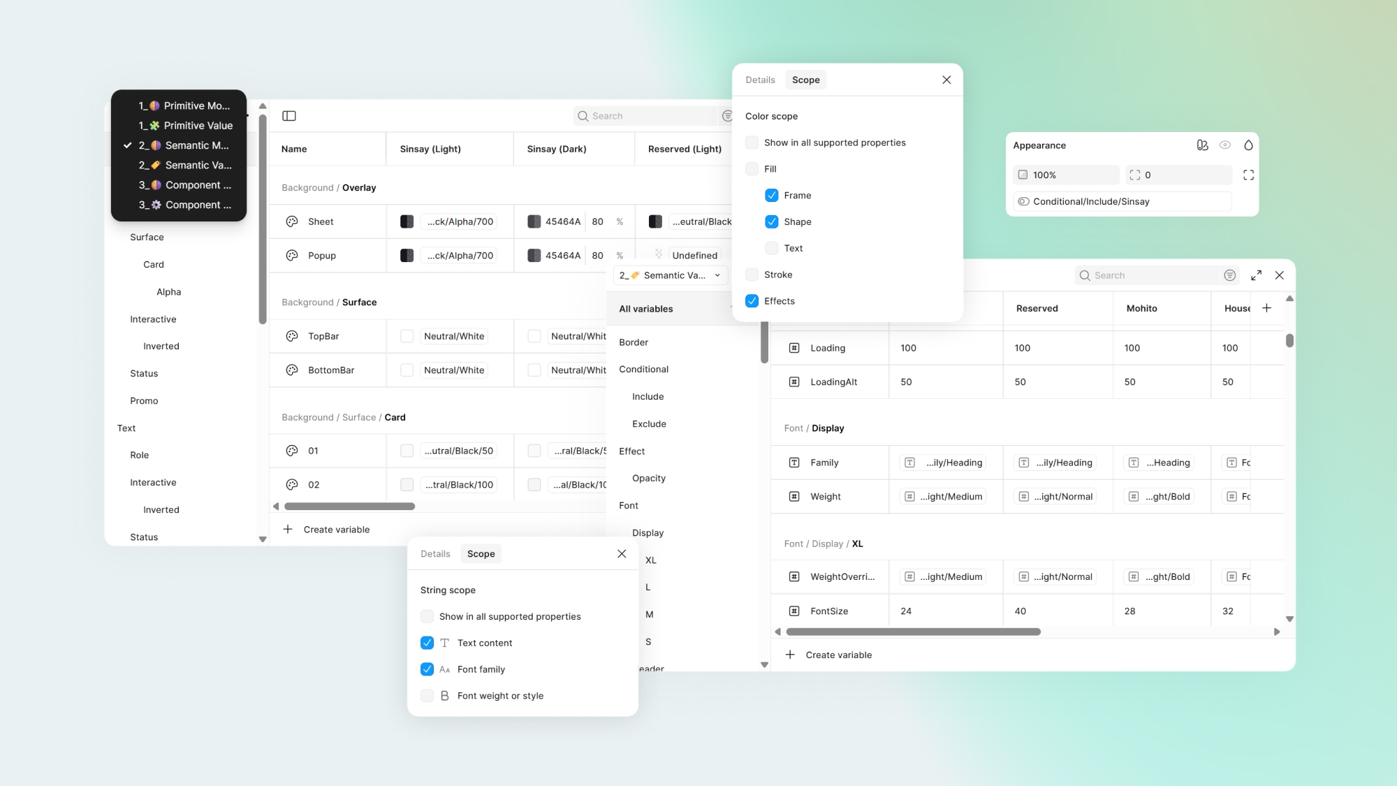
Variable collections
Figma variables became the backbone of the entire solution:
- Four types of properties define the design language and configurations at both asset and component level.
- Modes enable multibrand flexibility and scalability of our definitions.
We considered Tokens Studio—which offers a more expansive, market-driven approach to token management—but ultimately chose not to use it due to the simplicity, flexibility, and team-wide accessibility offered by native Figma variables.
The key advantage of variables in our solution is that—beyond defining color, typography, and spacing systems—they also support complex configurations like component layout logic.
Building on past lessons, we defined new variable layers:
- Primitive - the foundational variables: colors, spacing systems, and other core visual properties.
- Semantic - defines the brand's design language. Here we introduce cross-brand logic like error colors or button roundness.
- Component - the most granular level, controlling attribute dependencies within individual components. This is the final layer where visual distinctions are made.
Code sync
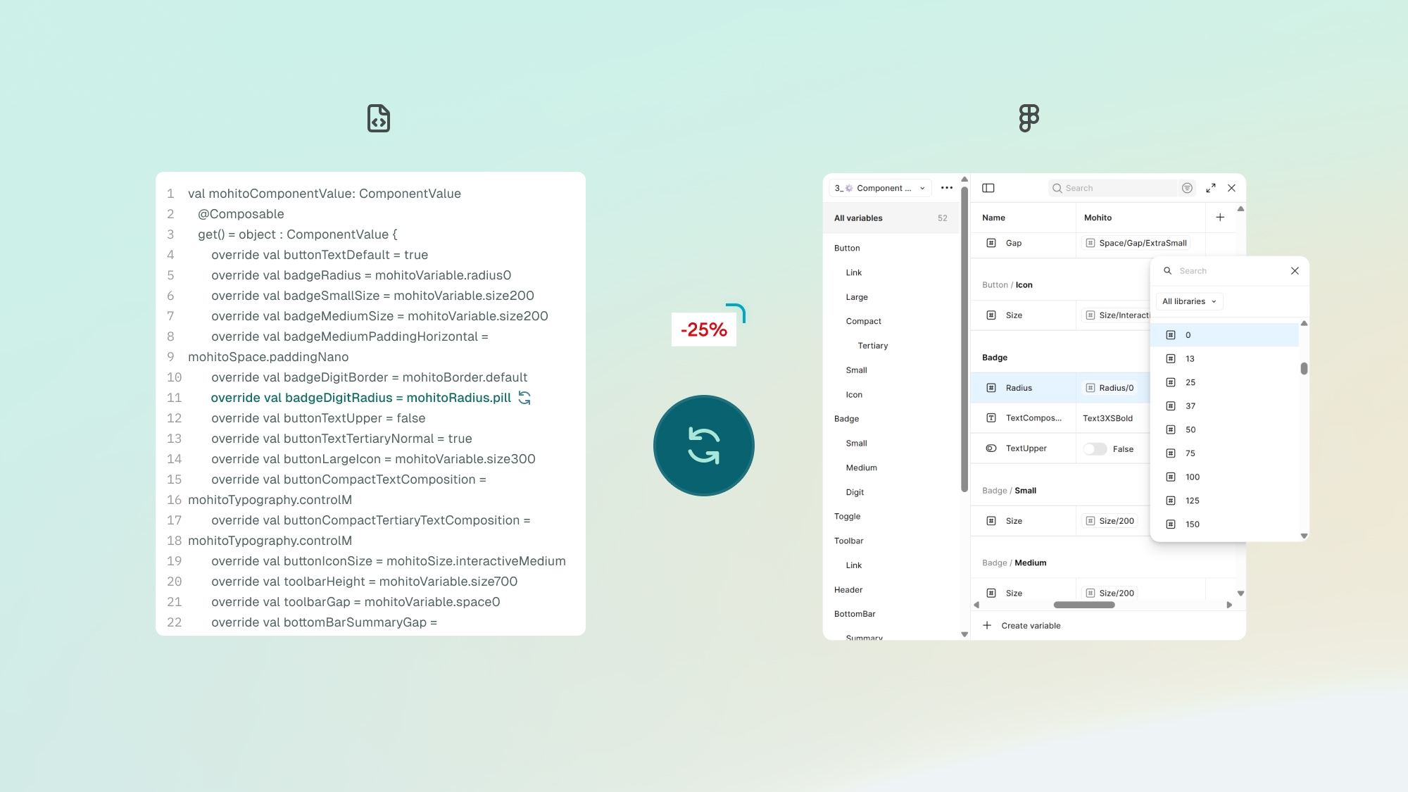
What good is this vision without full support on the development side?
Both the mobile apps and web platform are synced across all variable levels. In mobile, we use REST API for real-time syncing. On the web, we use Style Dictionary to export and parse tokens according to developers’ needs.
No more tickets to update backgrounds or font weights. Developers don’t need to double-check typography or colors in Figma’s Dev Mode. Everyone can focus on what truly matters.
One source of truth
The pain point in our old setup was fragmented documentation and the time needed to manage it.
Imagine 5 brands, across 2 tech platforms—each with its own set of Figma files. A real headache.
Now, each platform has its dedicated file structure—from basic color definitions to icon sets, illustrations, global components, and brand-specific modules. Each visual system entry point contains brand definitions—within one consistent file.
What does this give us?
- A solution made for one brand can be adapted for another with just fine-tuning.
- Documentation is centralized.
- Fixes and improvements can be propagated across all brands simultaneously.
- No more linking a dozen libraries when working on 2–3 brands at once. We work on platform-specific files only.
- A single place for component documentation gives us more time for real use cases, accessibility specs, and technical insights.
- We've finally started to reduce “design debt” that had accumulated for years—especially after taking over products from outside agencies.
Drag and admire
From all these ingredients, we’ve built something we truly enjoy using daily.
Assign multiple collection modes to a section or a full page in Figma, and you can swap any brand's layout—whether it's a screen, component, or entire user flow—with a simple drag-and-drop or copy-paste.
All properties, component settings, and typography rules stay intact.
No more rewiring components manually or fixing instances due to mismatched libraries, inconsistent props, or color gaps.
AI Assist
AI played a key role in shaping and scaling our new libraries. We constantly explore opportunities to automate and offload repetitive work..
So far, we've implemented:
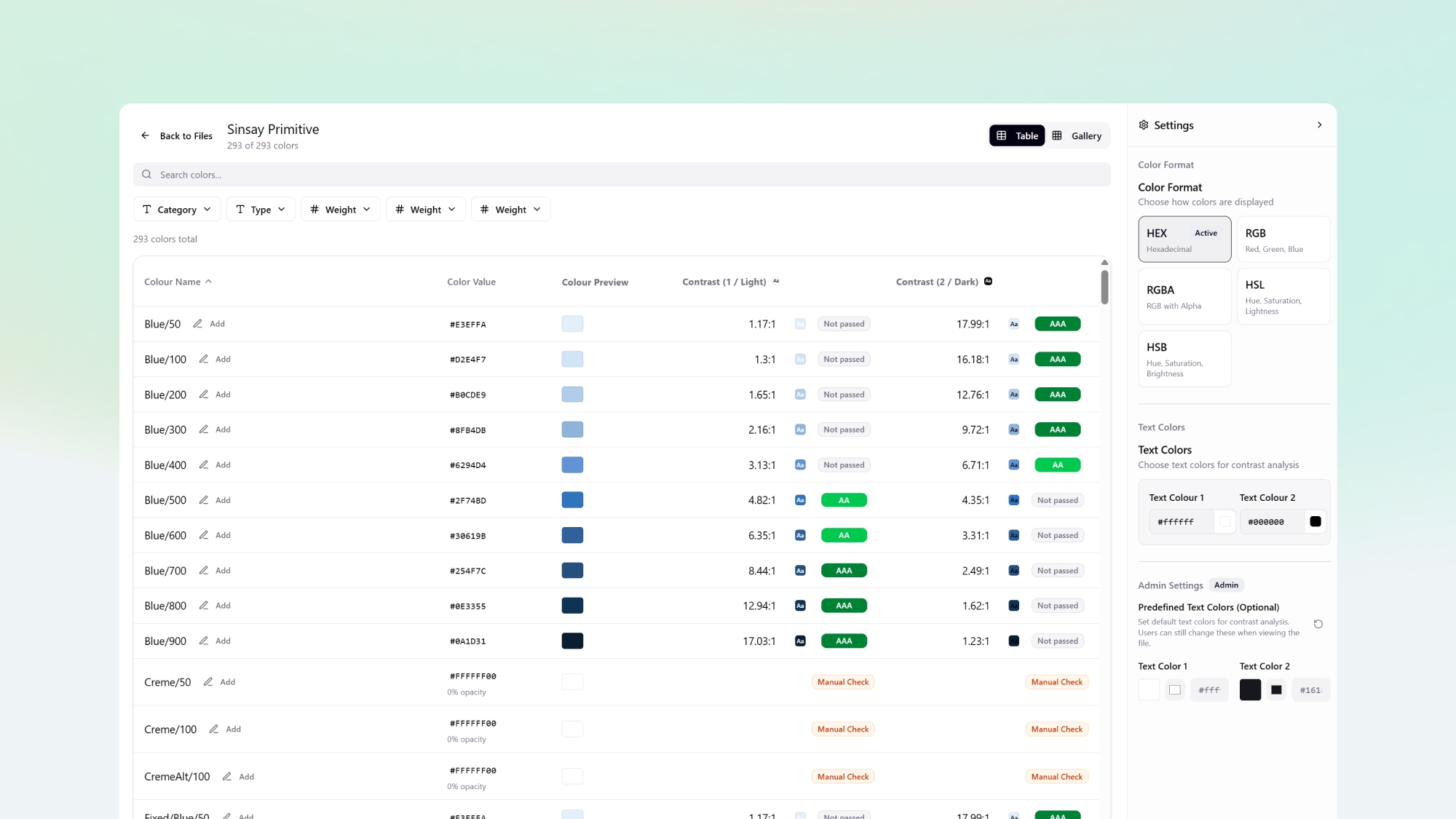
- Auto-generated visual documentation for all variable levels and modes.
- Automated palette checks based on light/dark backgrounds, with suggested font colors for proper contrast (A11y)
- Generated descriptions, alt names, usage scenarios, and a11y notes for components
- An interactive, AI-supported roadmap for library development
Conclusion
We’ve reclaimed time for creative work that transforms our products. We can replicate functionality across brands in just a few clicks. And we spend our energy solving complex problems with developers—instead of debating pixels or shades.
We use our tools to their full potential. With every update, we stay ahead of what’s possible. By aligning design with code, we focus on what truly improves the user experience—not on repetitive, low-value work.
That’s the gist of it. Thanks for reading—and feel free to reach out on LinkedIn. I’d love to share more. 💬